Shyft & Mindhouse
How we helped two sister brands as a support design team
70%
Decrease in sales team intervention
15x
Increase in direct purchases via the landing page
3x
Increase in revenue from the therapy flow
- Status
- Finished
- Deliverables
- Design System, Landing Pages, App Redesign
- Duration
- 8 months
- Year
- 2023
- Project scope
- UI Design
- Design System
- Research
THE BRIEF
We worked with two sister brands, Shyft and Mindhouse, over the period of 8 months as a support design team. Over the course of this time we worked on a variety of projects.

Shyft combines lifestyle management solutions - Nutrition, Yoga, Exercise and more to help our customers track, reverse and manage chronic health conditions
Mindhouse is a mental health & wellness platform that offers meditation, therapy and community support based solutions
Shyft Design System
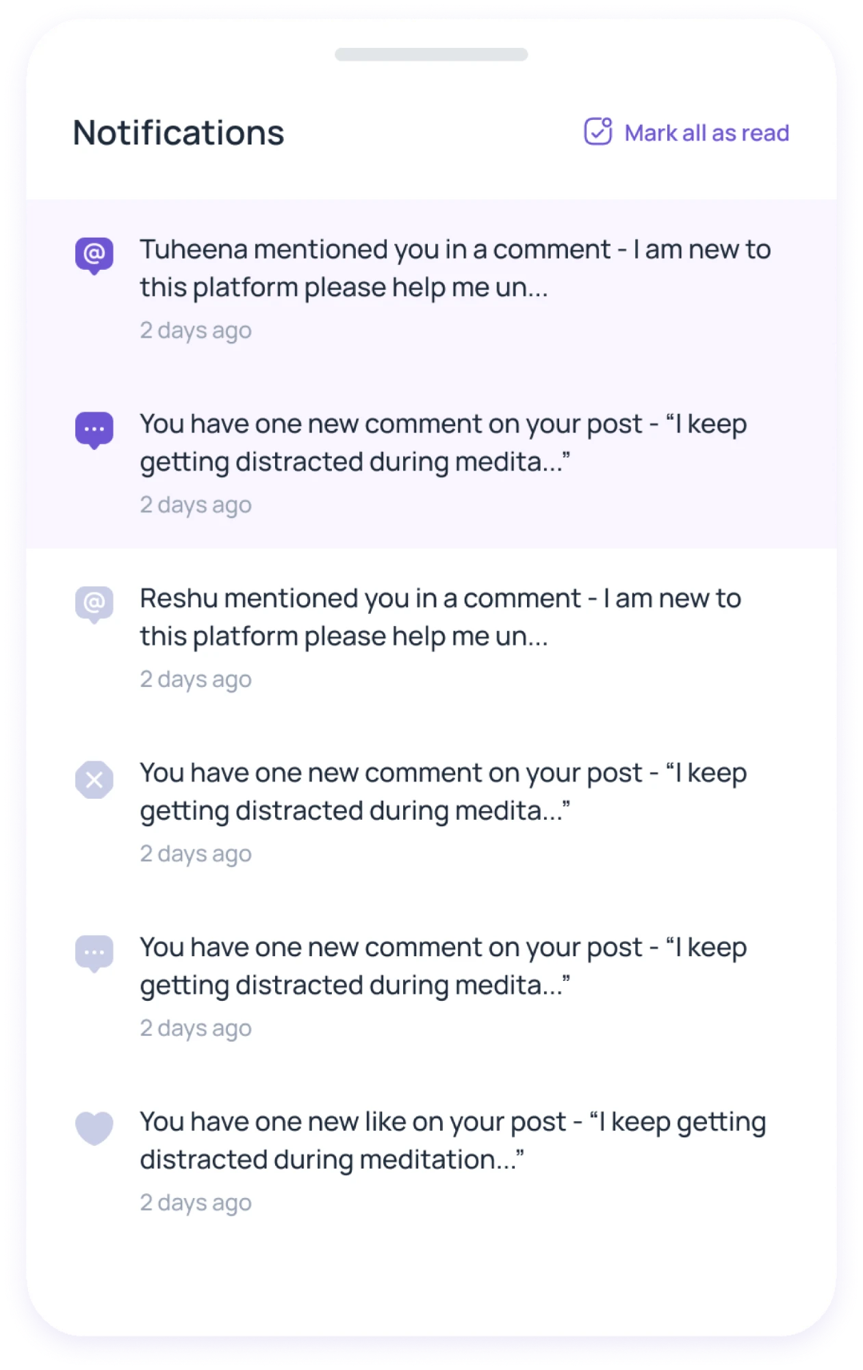
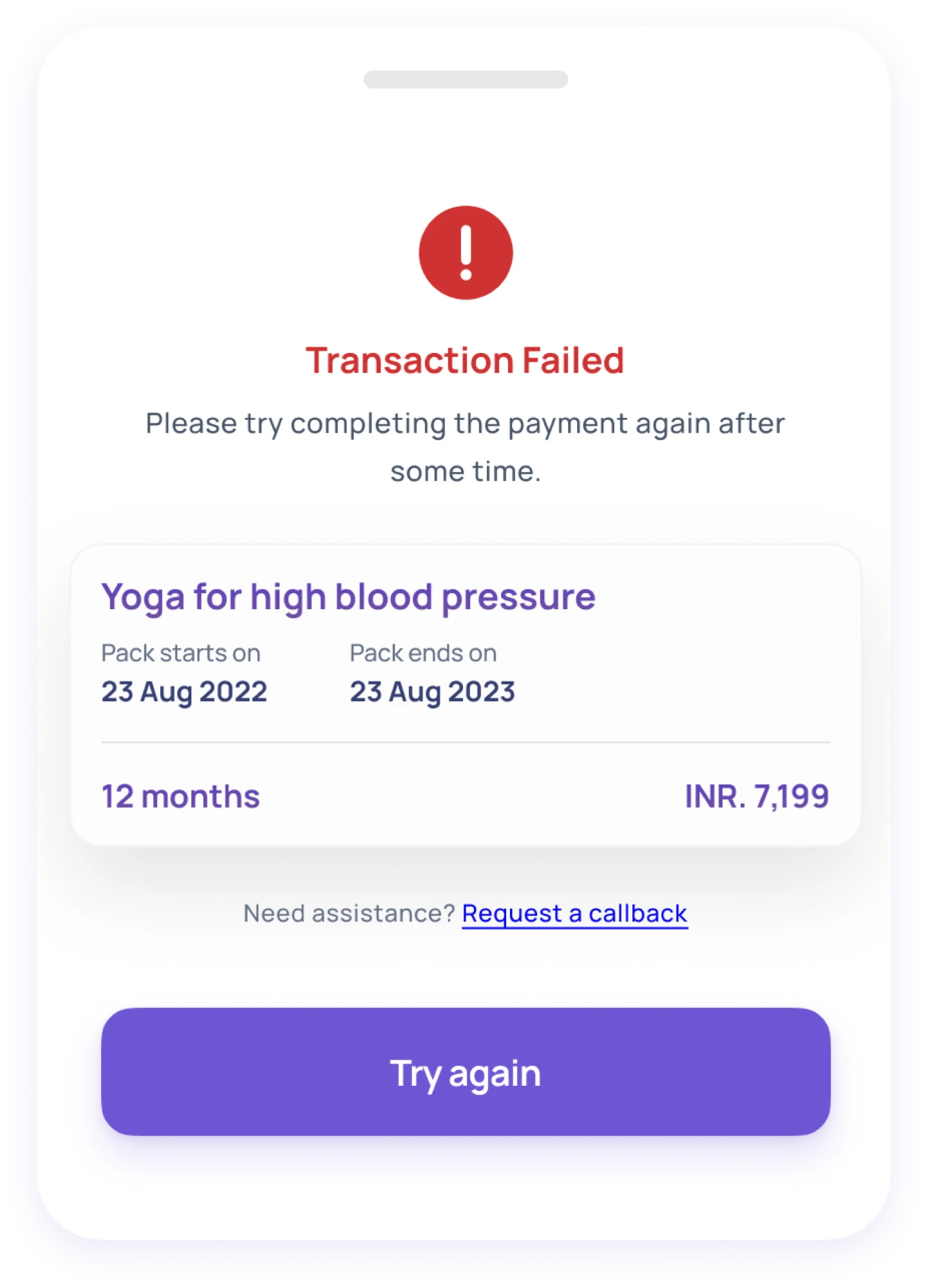
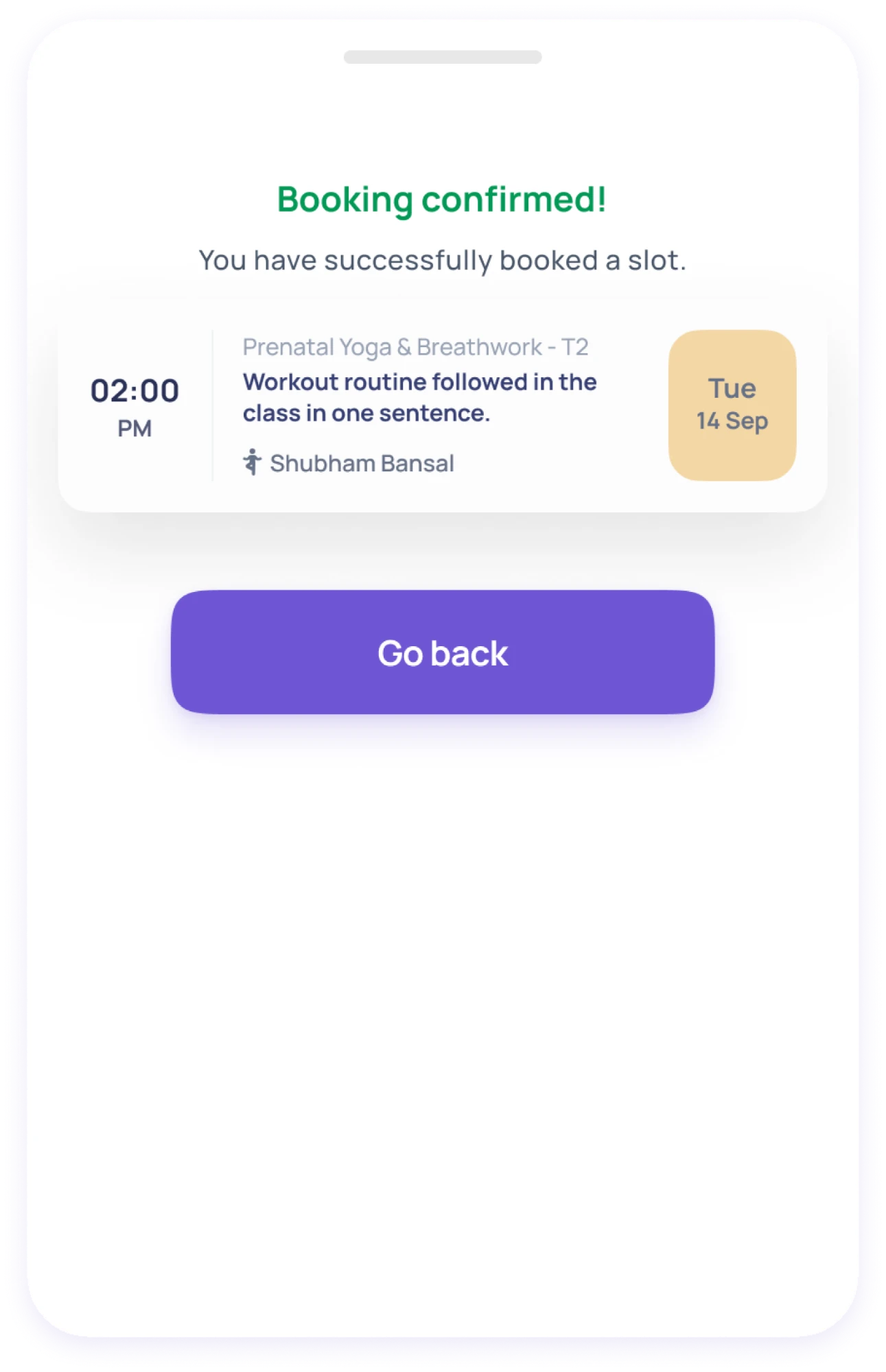
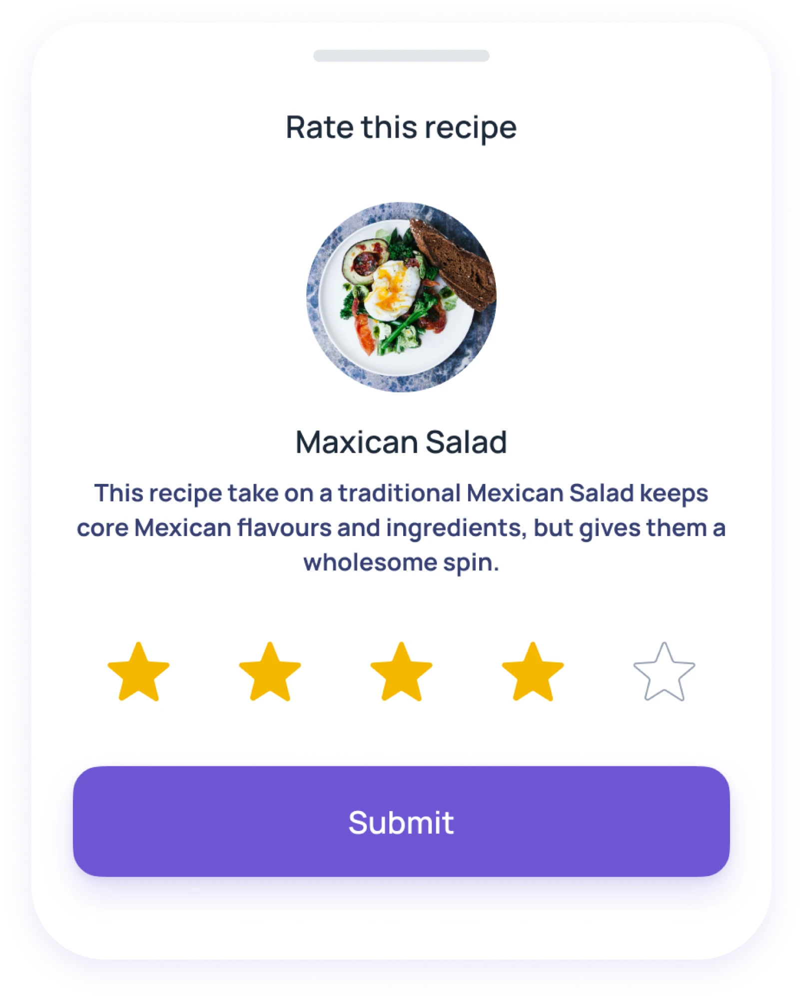
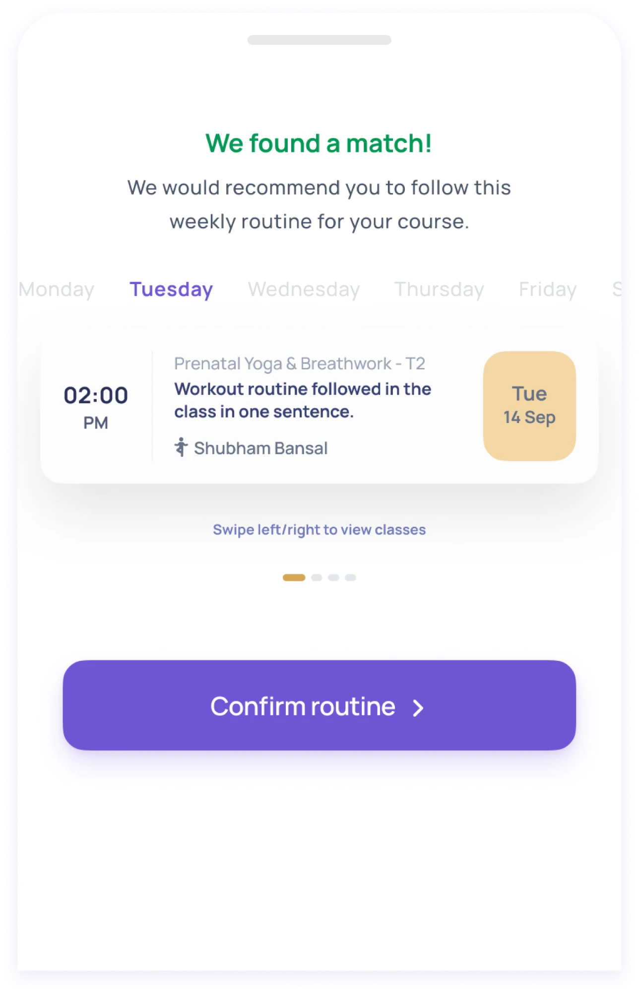
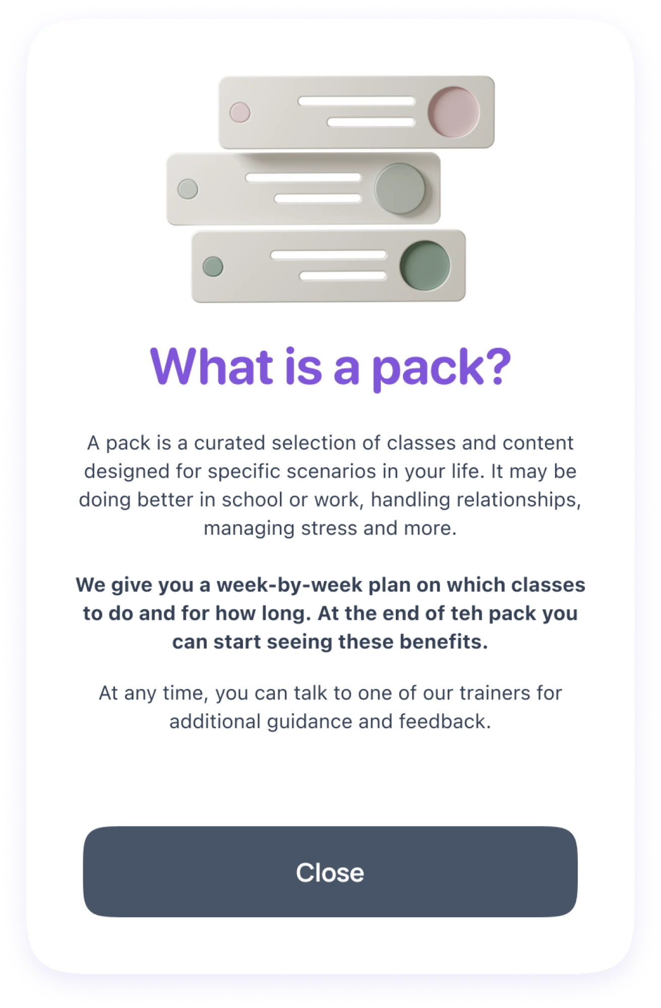
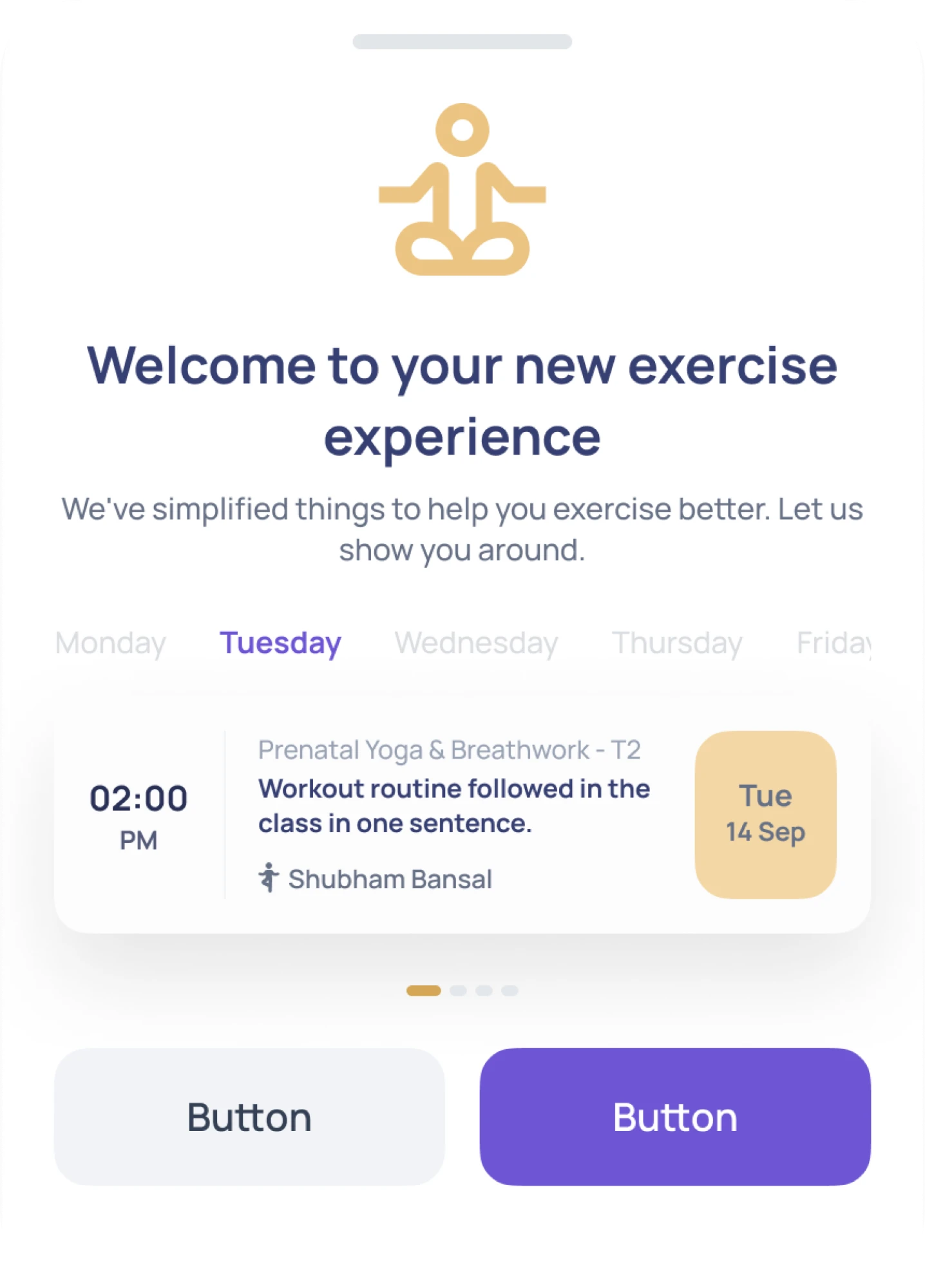
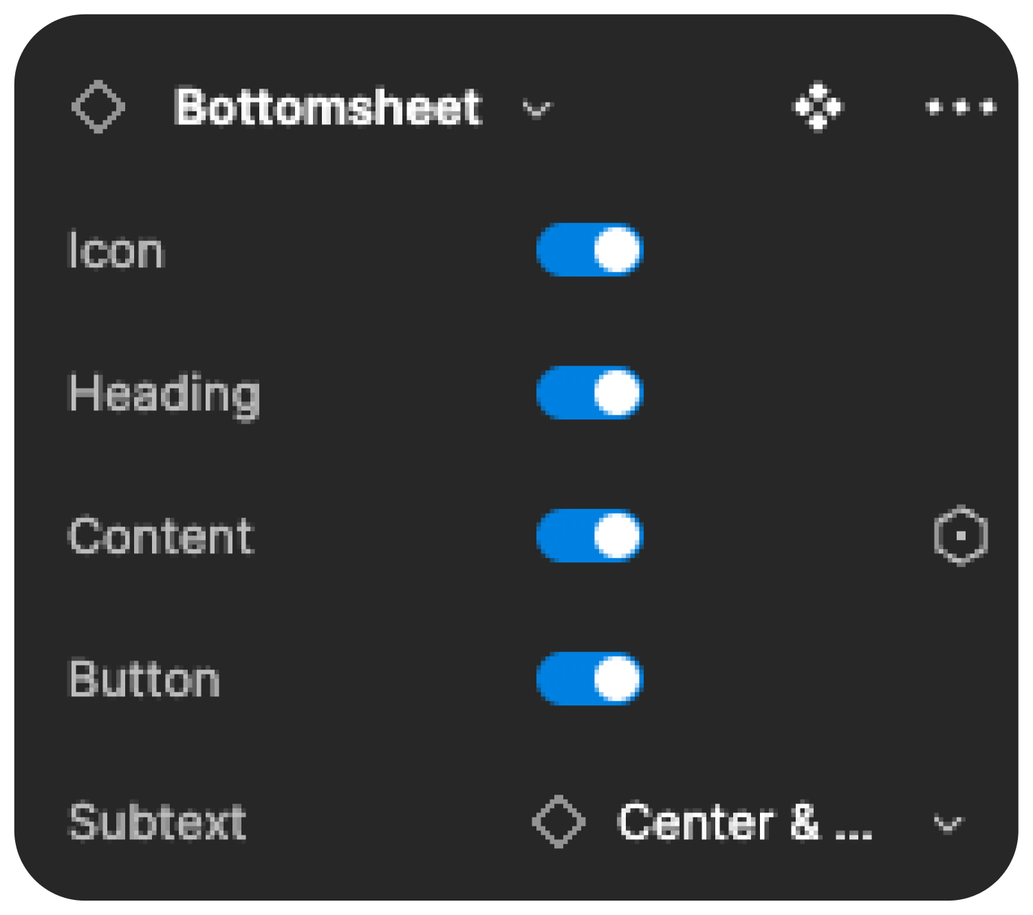
We thoroughly audited the existing design components in Shyft’s mobile app design system. We were able to identify significant redundancy and streamline the design system. This greatly reduced the design debt and enabled the team to move faster.

12 instances of the bottomsheet component, simplified into one with variants.


Designing for Conversion
Shyft ran ads about their bootcamps, and we helped them supercharge their conversions. We designed a dynamic landing page template that helped streamline their deployment time and enabled visitors to discover what resonated with them.
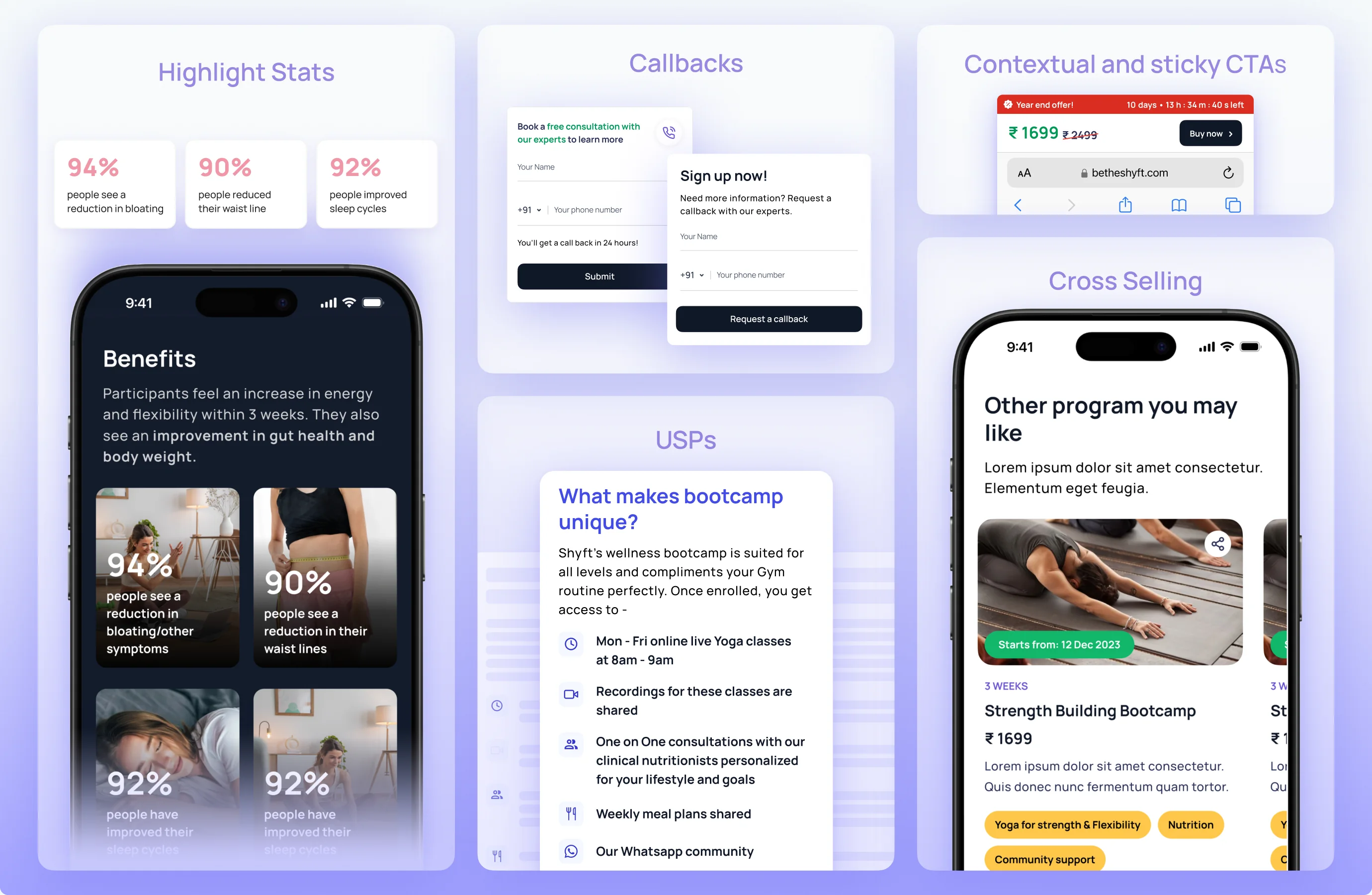
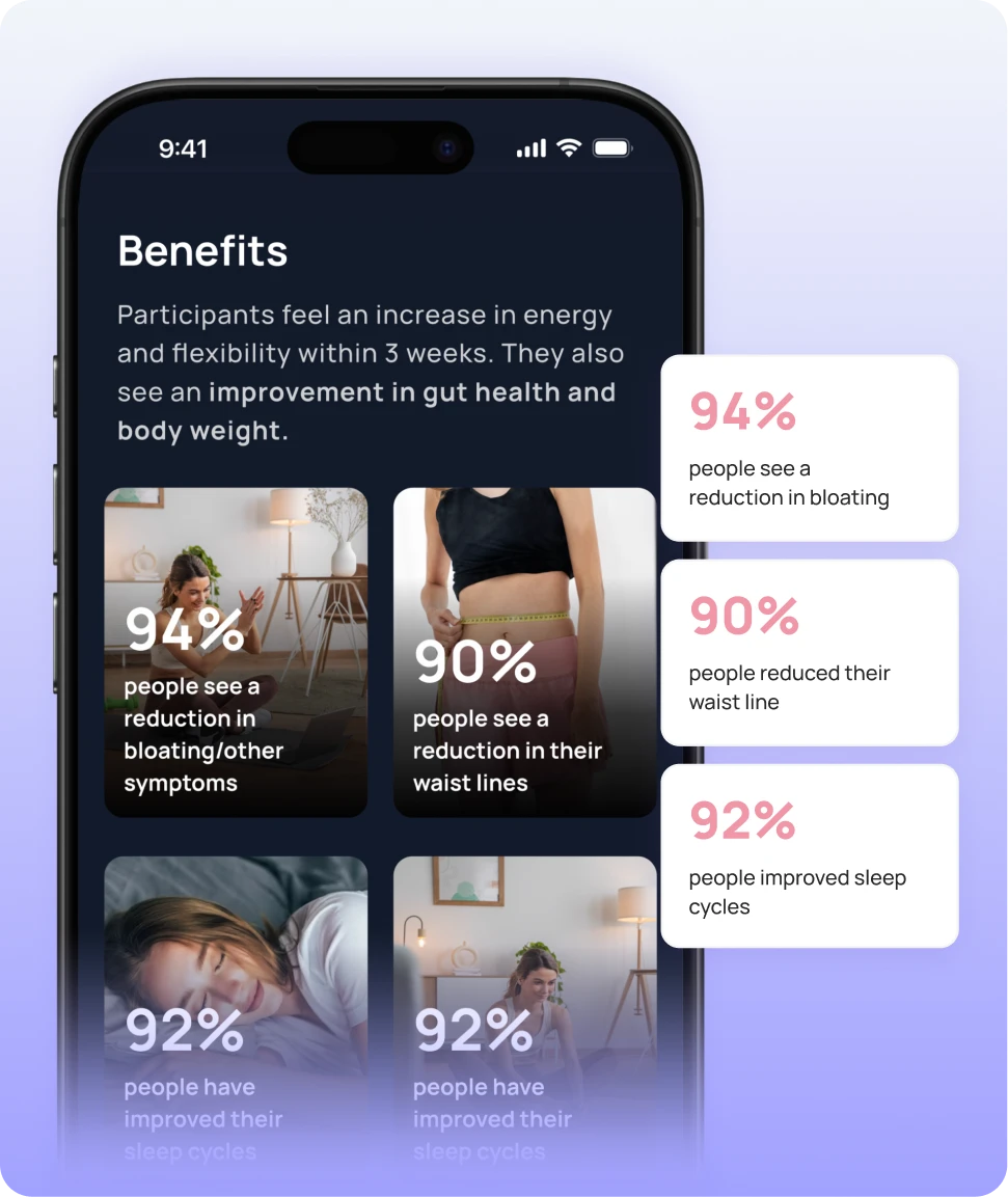
Highlight Stats
We highlighted stats that showed the impact of the program on participants
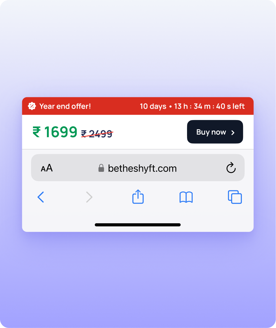
Contextual & sticky CTAs
A sticky bar keeps the price, the offer’s countdown and Buy now on screen as visitors scroll, so buying is always one tap away
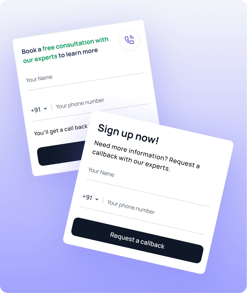
Callbacks
Visitors with questions can ask our experts for a call back, instead of leaving the page to find an answer
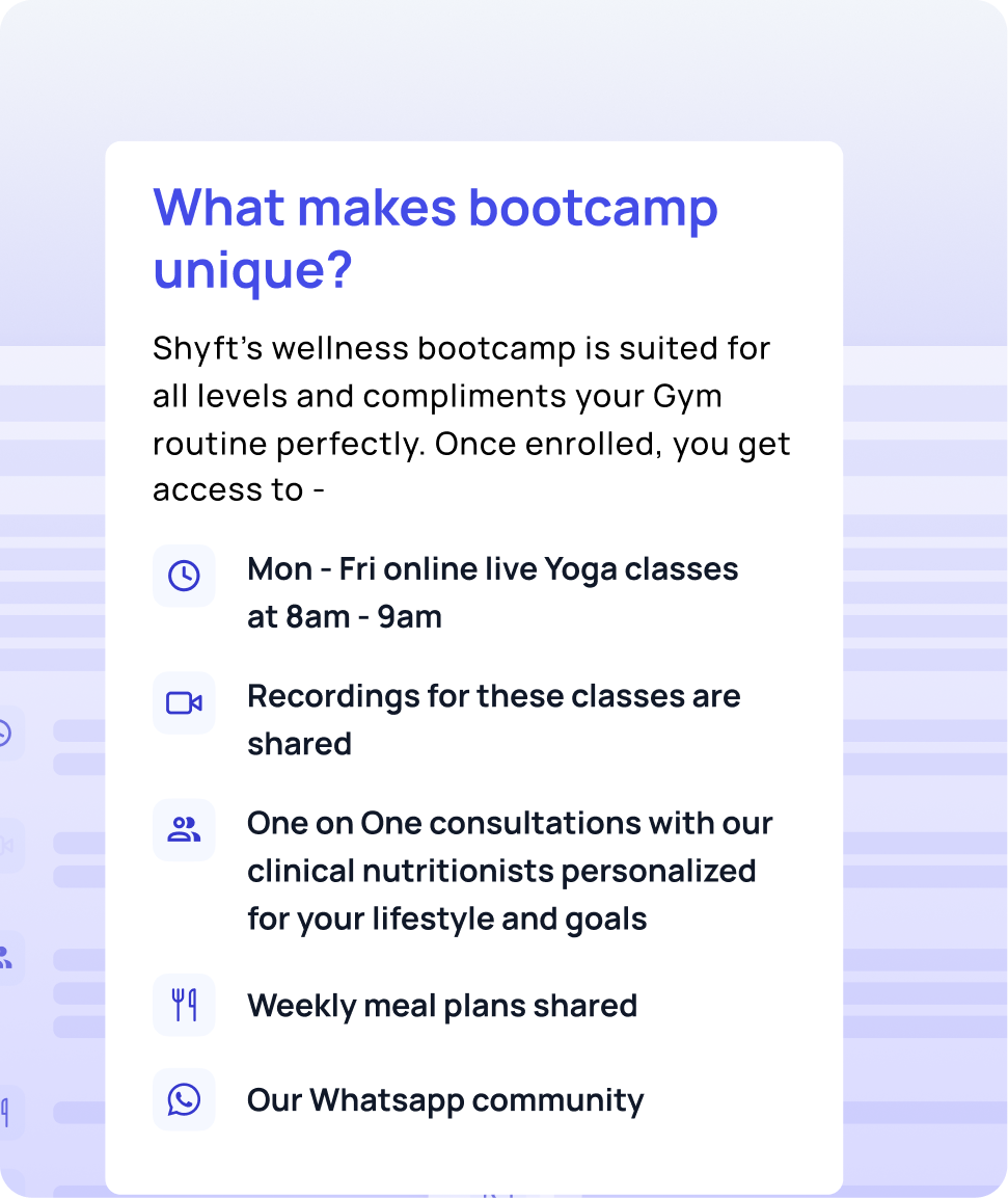
USPs
What each bootcamp includes, set out plainly, so visitors see its value before they see its price
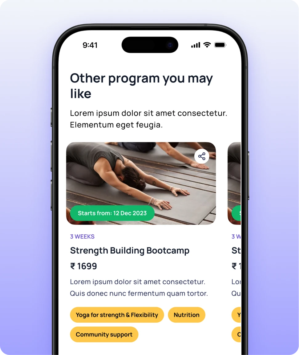
Cross-selling
Other programs at the foot of the page give visitors who aren’t sold on this one somewhere to go next
Designing for Shyft Pass
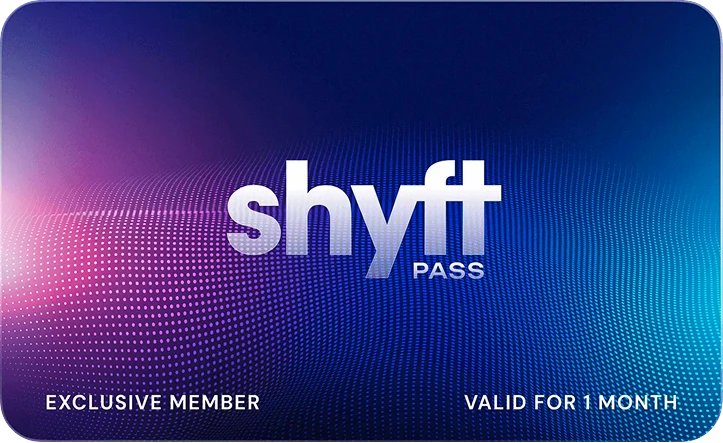
Enhanced the Shyft Pass landing page by elevating the brand’s appeal and incorporating micro-interactions for increased engagement, effectively drawing visitors in.
Scroll inside a screen to read further down the page.
Revamp UI to elevate brand
The brand wanted to move into a more modern and active lifestyle based space
Improve pricing strategy
Surfacing pricing plans in a structure that makes it easy for the user to understand and transact
Storytelling to drive conversions
Reworked the content on the Shyftpass with the Sales team to boost conversions
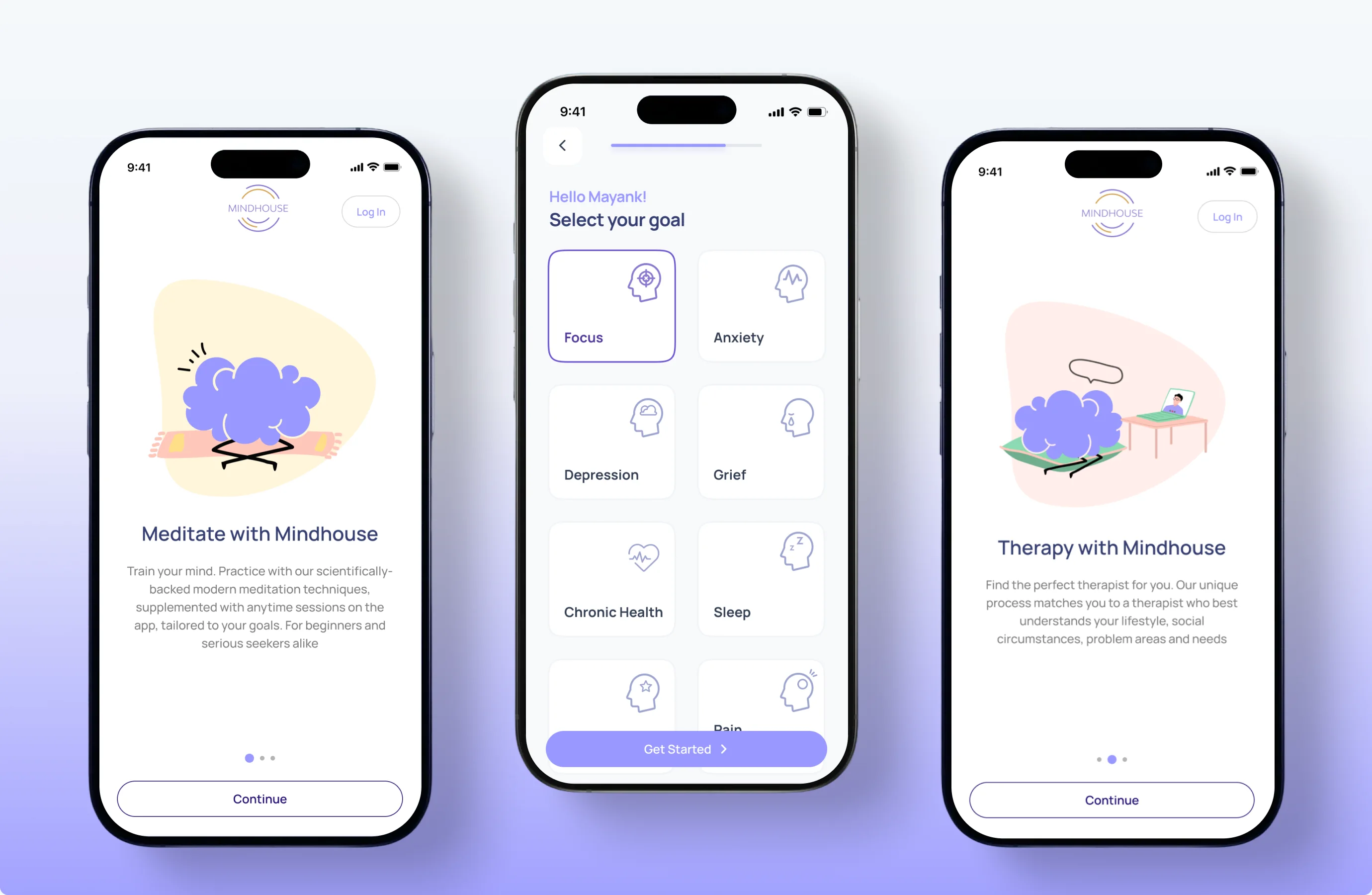
Redesigned the Onboarding
As Mindhouse added new verticals, the onboarding needed to introduce its features and gather user details to personalise the experience. We redesigned the flow end-to-end to reflect the platform’s expanded offering.
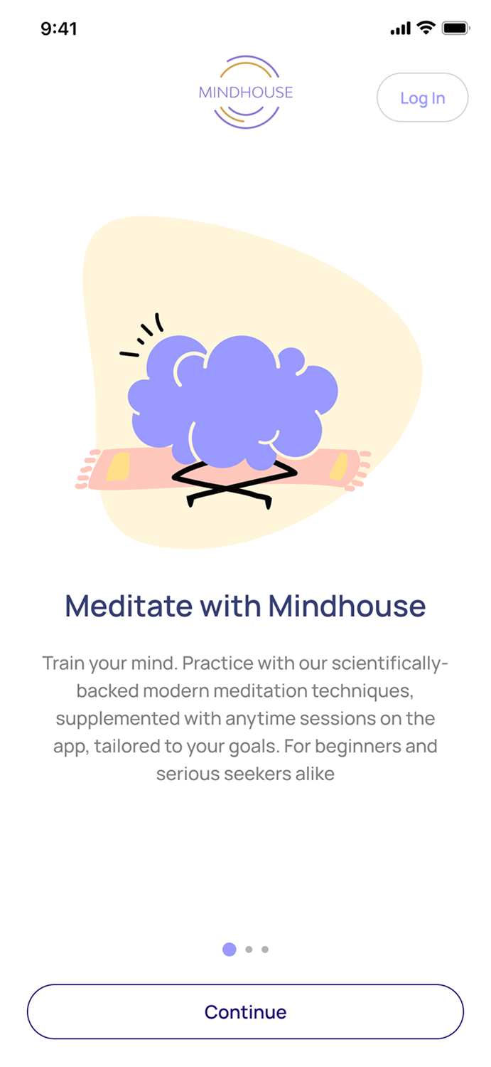
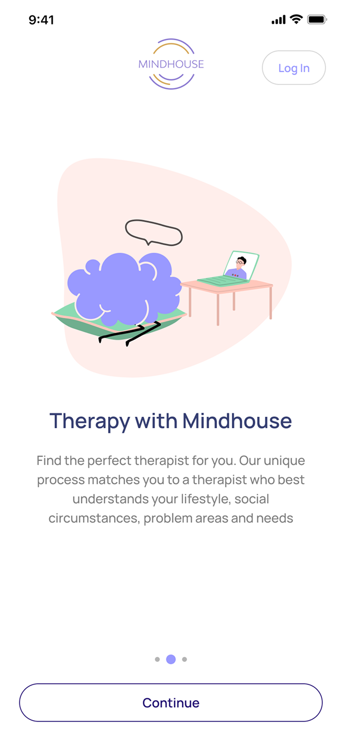
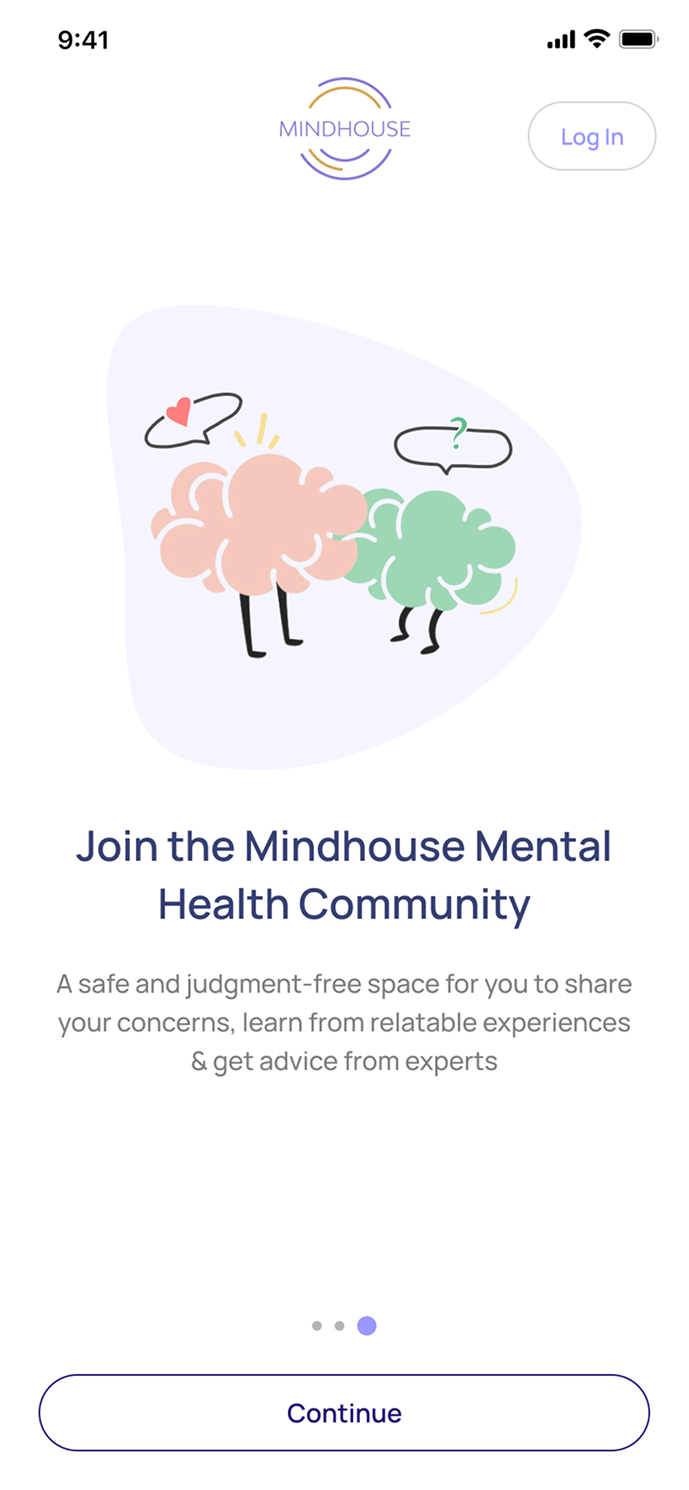
Designed the Therapy Flow
Mindhouse operates within the mental health sphere, providing users with recorded mindfulness content and access to mental health communities.
On recognising the need to further enrich their offerings, they strategically introduced Therapy. This addition expanded their services but came with the need of seamless therapy experience for the end users.

Challenges in the therapy landscape
Lack of awareness and stigma associated with therapy
Despite the recent surge in mental health awareness, we observed reluctance among people to seek professional help for their mental well-being
Not finding the right therapist and associated fatigue
Another significant hurdle, once people overcome their stigma of therapy, is finding the right therapist. Oftentimes people cycle through multiple therapists before discovering the right fit and can be an exhausting process, which leads to abandoning therapy altogether
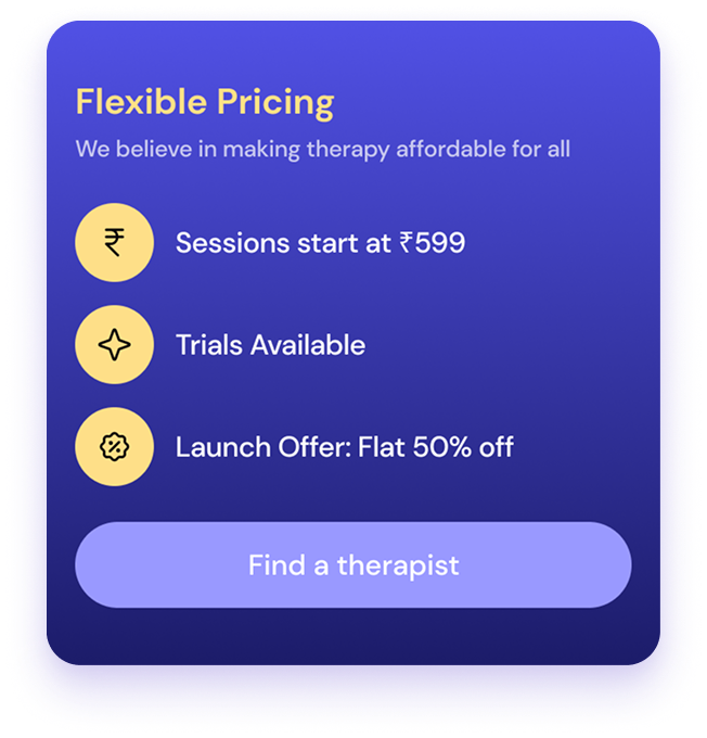
Cost Factor
The general perception is that therapy comes with a heft price tag, deterring many from seeking help when needed. This cost barrier often prevents individuals from getting therapy.
Designing to overcome the challenges
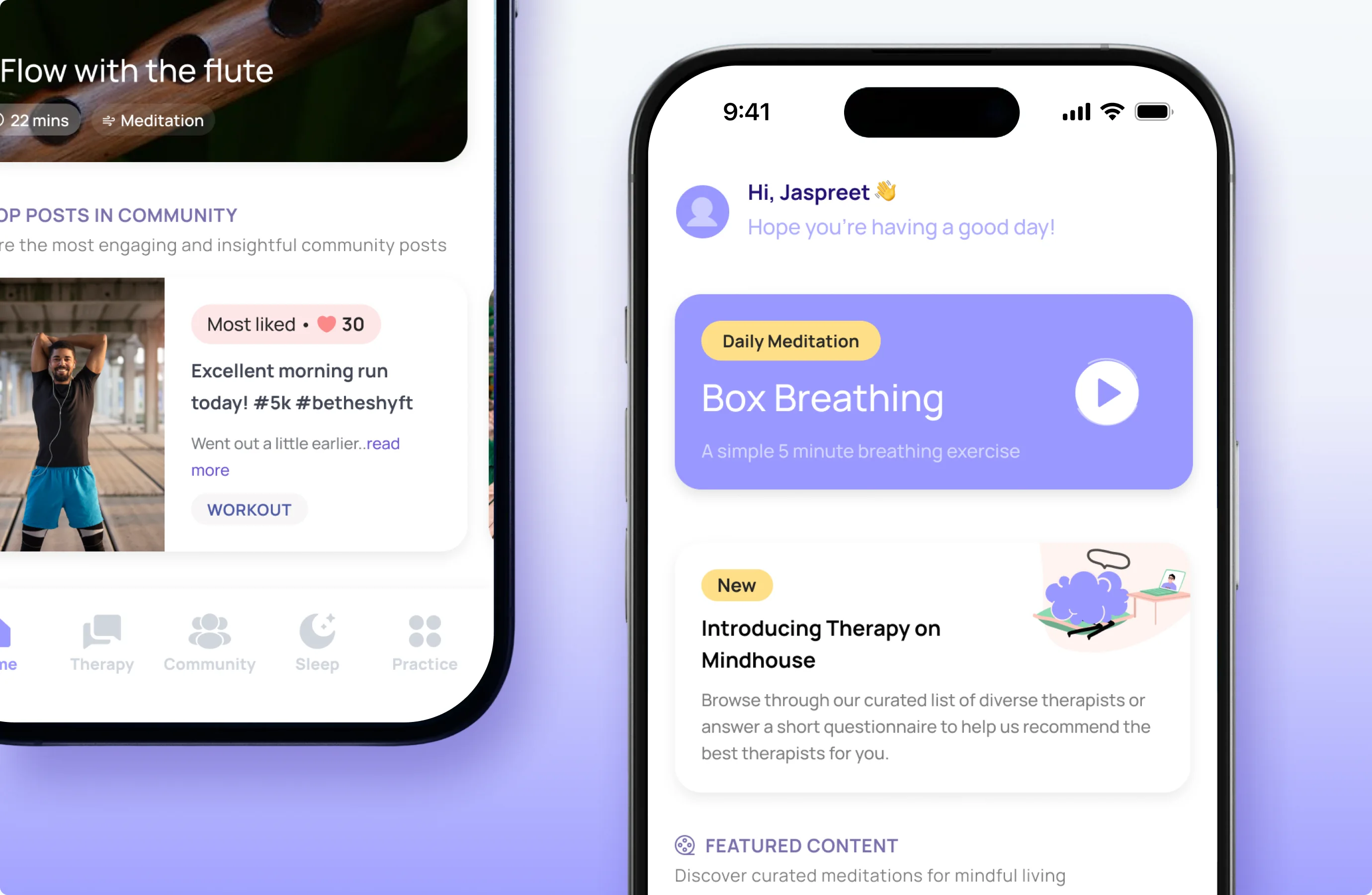
Dedicated feature sections accommodate the platform’s expanded offerings — from mindfulness and community to therapy — giving each vertical the prominence it deserves on a single, cohesive home screen.
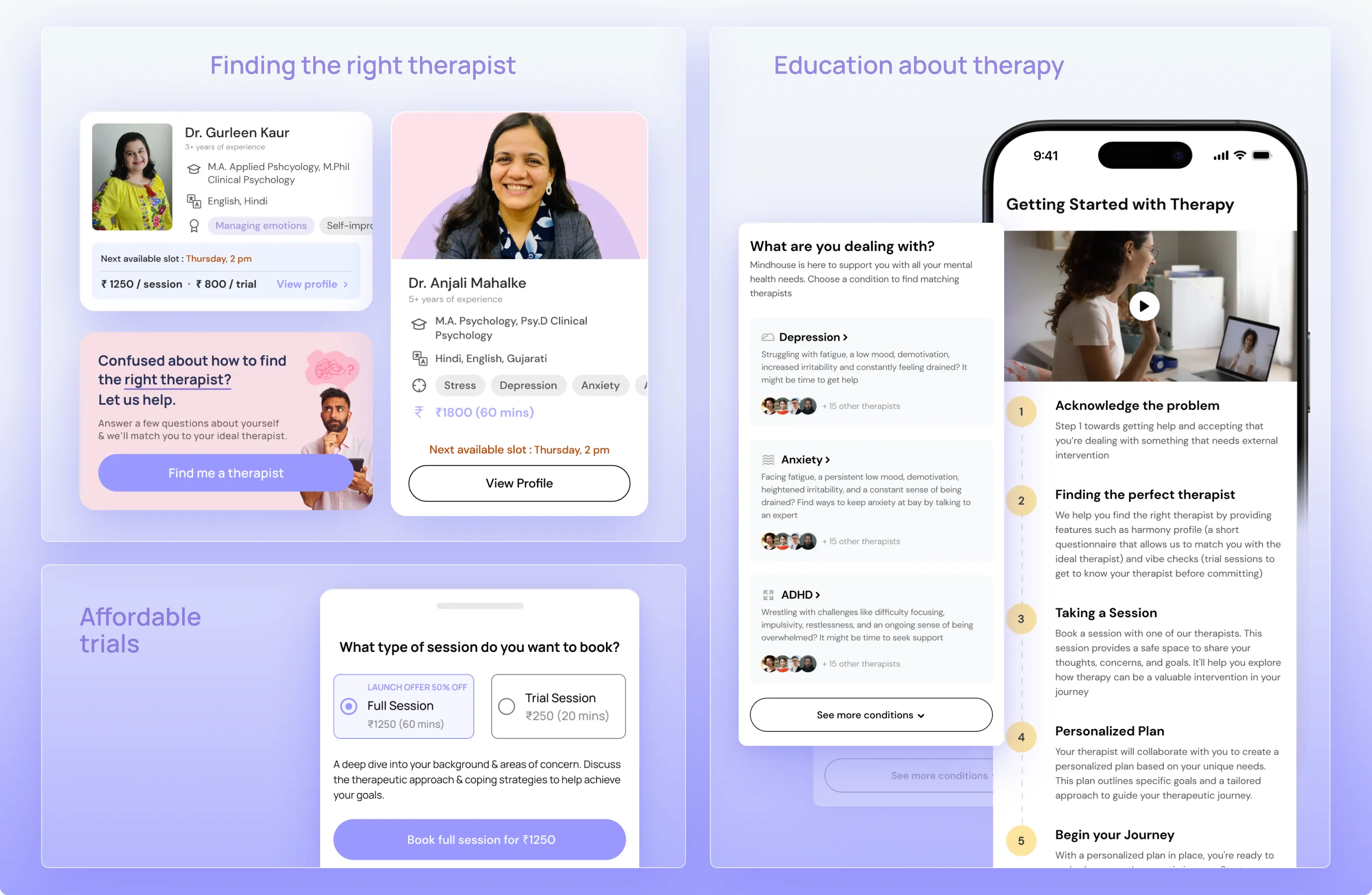
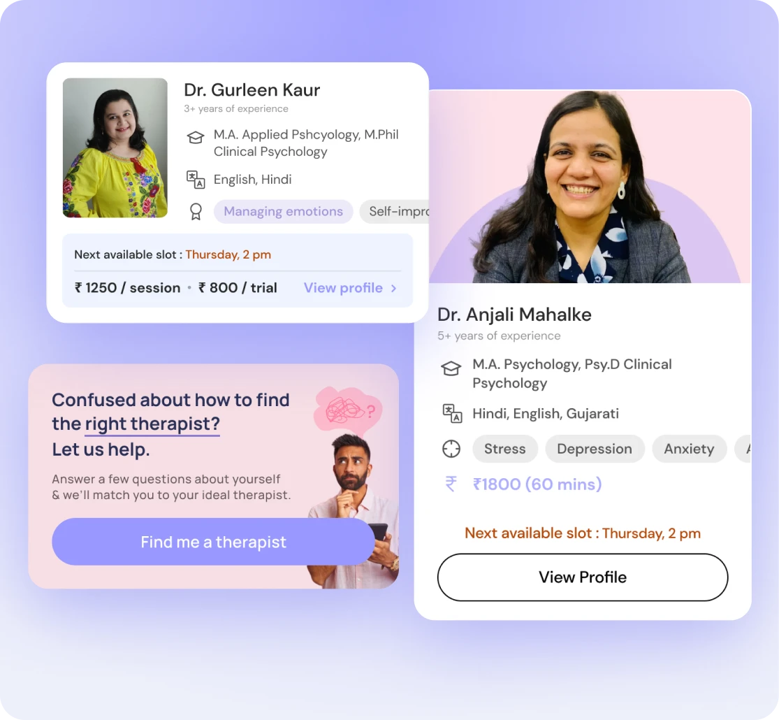
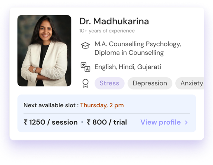
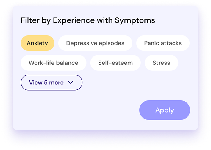
Finding the right therapist
Understanding what attributes people look for in a therapist.
Allowing people to browse and choose a therapist by themselves.
For people who may not be able to discern the right therapist for themselves, we created a matchmaking flow where users could answer questions about themselves and how they’re feeling to match them with a short list of therapists that would be appropriate for them.
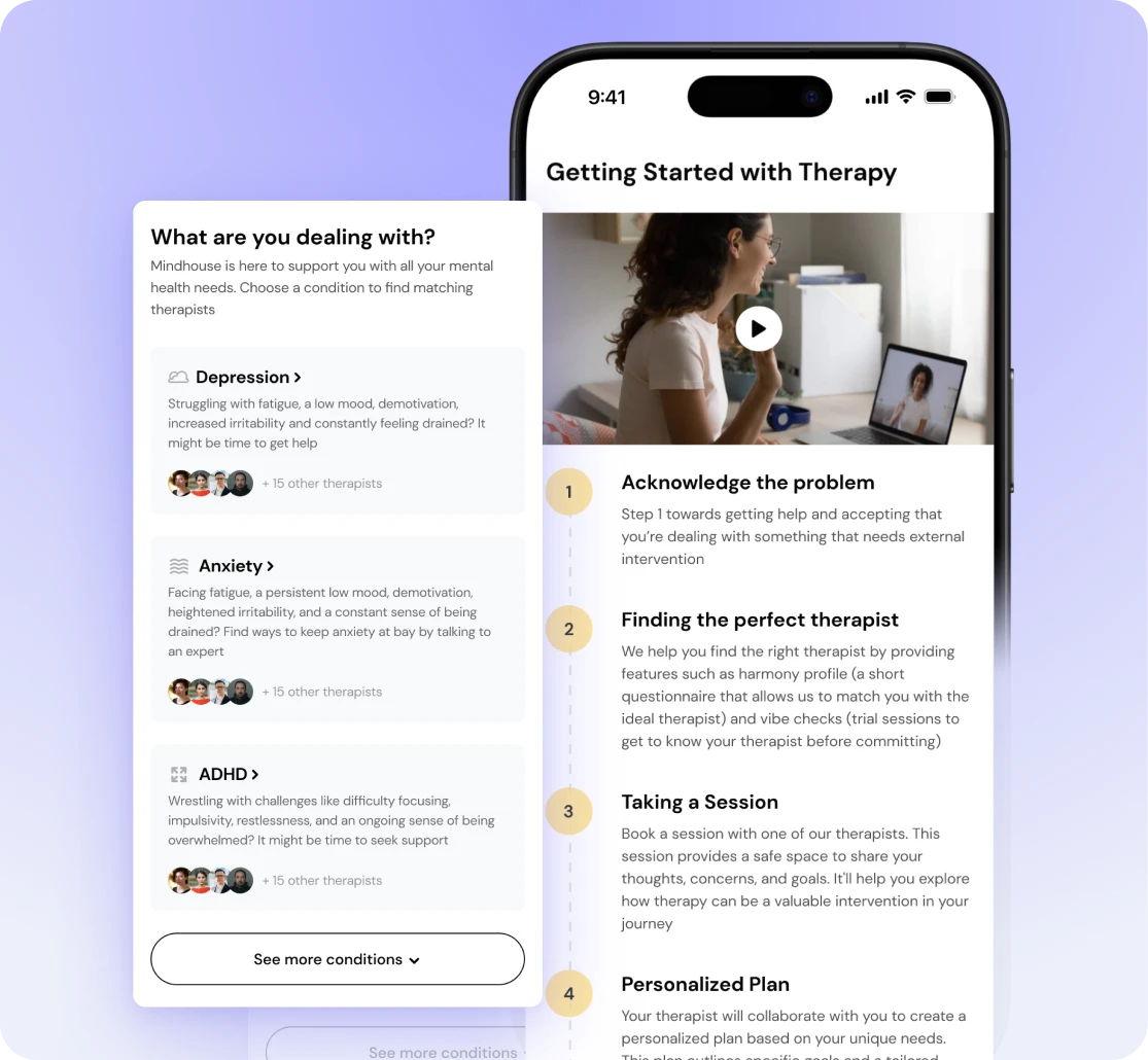
Education about Therapy
Real life problems that can be addressed by therapy. We surfaced use cases on the Therapy landing page to increase relatability.
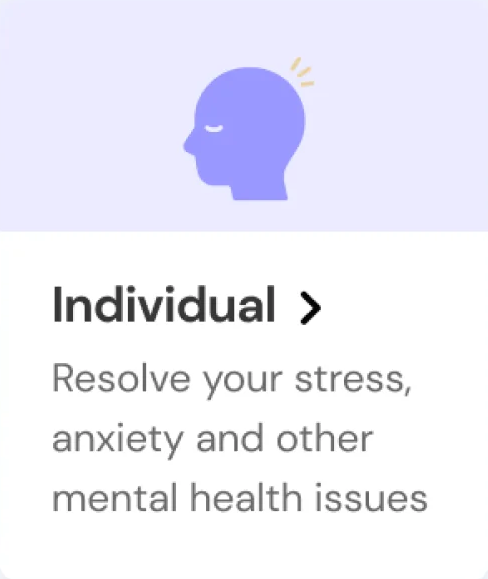
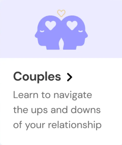
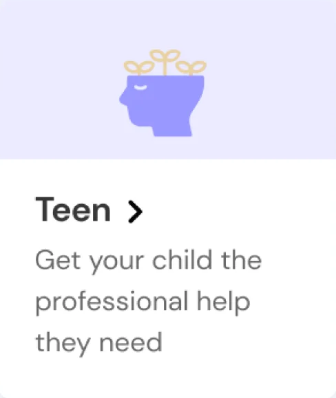
We split user types into 3 to allow them to exercise control over their journey.
Talking about clinical conditions to educate users about conditions they may or may not be aware of.
Giving a clear sense of what they can expect going forward to increase trust and predictability.
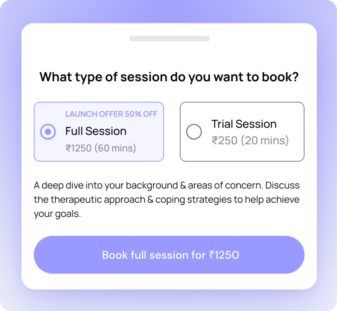
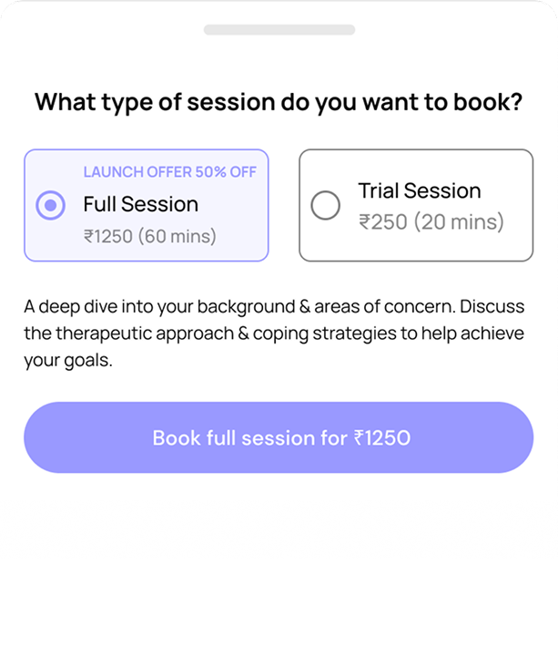
Affordable Trials
Introduced economical trials for people to be able to get a sense of therapy and the therapist at a reasonable cost
Crafting the UI for the entire therapy flow
Dedicated feature sections accommodate the platform’s expanded offerings — from mindfulness and community to therapy — giving each vertical the prominence it deserves on a single, cohesive home screen.
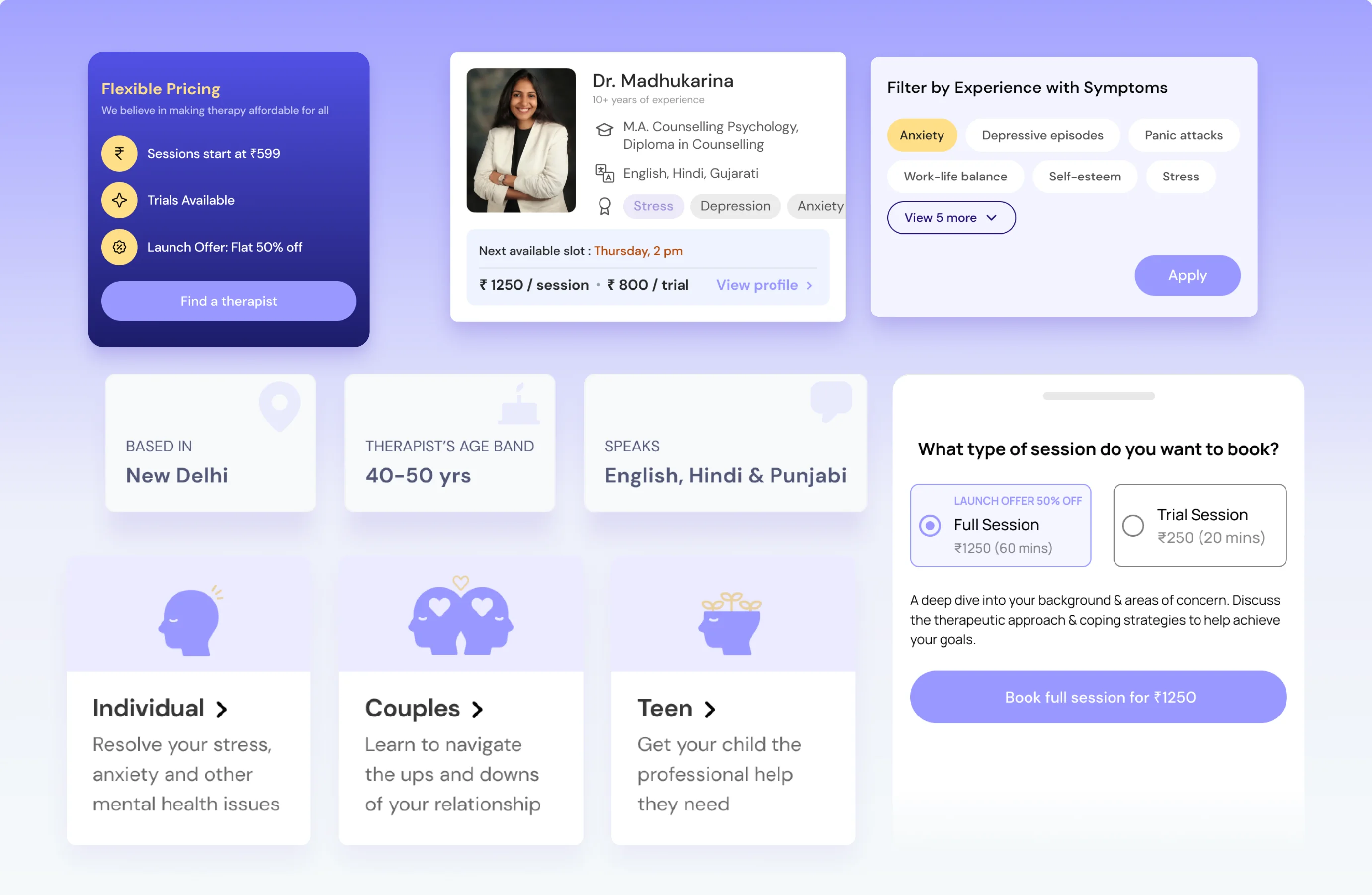



Post launch optimisation
Once the Therapy flow had spent some time in the market, we began to optimize it for conversion. To do so, we looked at data to gather usage insights and used our initial research. We were then able to make iterative changes to impact key metrics.
3x
Increase in revenue
Improved distribution of leads amongst therapists on the platform
Redesigned the Mindhouse App Homepage
Dedicated feature sections accommodate the platform’s expanded offerings — from mindfulness and community to therapy — giving each vertical the prominence it deserves on a single, cohesive home screen.
“Absolutely loved working with the team at Tibba Design Studio, would highly recommend hiring them to help turn your company around from a design POV while keeping business objectives at the forefront”
 Arjun BhandariFirst Employee, Shyft & Mindhouse